Enigma code:
Barthes enigma code is a theory that suggests a text(whether that be television,film or a poster etc) portrays a mystery to draw the audience in and and pose new questions about the piece therefore becoming intrigued by the piece.
The five codes:
The Hermeneutic code: The voice of truth.
This is an element in a story that is not explained and therefore, exists as an enigma for the reader(an enigma is something that is mysterious or difficult to understand)raising questions.
The proairetic code:The voice of empirics
The semantic code: The voice of person
The symbolic code:The voice of the symbol
The cultural code:The voice of knowledge
These Enigma codes affect the consumers view on the title sequences because it adds a sense of mystery to the title sequence which draws the viewers attention and engages them into the film since they do not know what is going to happen but the way the title sequence has been set up makes them want to know what the story will be about and what the conclusion to the film will be.This engages the audience before they have even started watching the film.
Friday 31 January 2014
Monday 27 January 2014
Audience profiling and logo
Week 3: Tuesday+Wednesday (Leanne)
-Research the codes and conventions of horror, paying attention to title sequences
-Write an audience profile (primary and secondary) for your film's target audience
-Analyse one sequence from chosen genre individually and one as a group. Note any features to include in own work.
-Invent a production company and design a logo for it.

This is our logo for our production company; it is a combination of our first initials (Terry, Aiden, Louis, Lauren). As our production comapny produce films within the horror genre we decided to use simplistic and dark colours.
Codes and Conventions:
-low key lighting
-faint images
-foreshadowing of bloodshed
-isolation
-scenery – rural
-foreshadowing
-killer – glimpse of character
-sets equilibrium
-knife – foreshadowing – physical weapons
-medical imagery – experiments
-dark clothing, not suits, jeans and
t-shirts, trainers
-hand held – shaky
-close ups
-tracking
-point of view shots
-low and high angle shots
-pan movement
-establishing – isolation

Features to include with title sequence:
- Handheld footage
- Generally slow paced editing (slow motion)
- Orchestral music
- Connotations of blood
- Connotations of weapons


Evil Dead Title Sequence
Week 3: Group Analysis: Evil Dead Wednesday (Leanne)
The beginning of the sequence shows the title of the film; Evil Dead. the title looks like blood vessels which connotes that the film will be about blood and death. The music is orchestral which builds tension within the audience.The use of the red and black contrasts and makes the red stand out. Red connotes danger and blood. The use of extreme close ups make the audience feel uncomfortable and nervous as they cannot see any characters and only weapons.


The shot of blood on the wood makes the audience think of cabins, which shows that the diegesis of the film could be set some where rural; like a cabin. The music makes the audience feel 'spooked' which makes the audience think of demons and part of the paranormal. There are multiple shots of skin/meat/flesh ripping, cutting, slicing, stabbing which makes the audience think there will be a lot of violence in the film. The lightbulb filling up with blood makes could symbolise no hope within the film and foreshadow that something bad will happen in the film.


There is a shot of a girl's head with a chainsaw ripping through it, this shows to the audience the brutality of the film and the level of violence within the film. The use of slow pace editing makes the audience feel tension building. The finger dropping into a pool of blood connotes and foreshadows themes of torture and death.


The use of scratchy font and symbols makes the audience think of paranormal, demons and a higher power. The chain symbolises torture, restriction and prison, this may foreshadow what will happen within the film. The music builds and gets faster, this makes the audience feel more tense and foreshadows more death. The fire could connote destruction, hell and chaos, this could foreshadow what happens in the film to the audience.


Kyle Cooper
Today we had to research into the work of Kyle Cooper and we found quite a few interesting facts about him.We decided to use powerpoint and all do research as a group into Kyle Cooper to find out about his life and attempt to decide whether he would be a suitable role to base our title sequence on.
Kyle Cooper had participated in making a few title sequences for our genre of movie.For example he helped to produce the title sequence of Dawn of the dead and even Se7en.This are two of the best sequences which could possibly play a role in the making of our title sequence.


Kyle Cooper had participated in making a few title sequences for our genre of movie.For example he helped to produce the title sequence of Dawn of the dead and even Se7en.This are two of the best sequences which could possibly play a role in the making of our title sequence.
Friday 24 January 2014
Napoleon dynamite tile sequence
Napoleon Dynamite title sequence begins with a very retro looking red shag pile rug with a plate of food layed upon it which has written on it the name of the production company.In many of the slides that follow this are of similar events in which the plate or bowl of food is presented to us with some form of text upon it with the name of either the actors or someone or even other people which showed a clear presenc in the making or producing of the film.
The first impression we get with the food is it is very fatty and greasy food such as eggs or burgers ect.This connotes to the viewers that the person who is conuming the food is a very unhealthy individual and clearly does not have a very healthy lifestyle.This could give the view viewer the impression that the main character may be unhealthy himself or even very either spotty or unclean due to the food which he has eaten.
This already sets up the audiences representation of the main charater which we shortly see when he opens his wallet to find an image of himself on his school ID.On this idea it told the viewer what year it was followed by his name and where the school was located.The school was located in a southern state Idaho which is often considered to be a more southern state because they have no major cities there and it has no real importance.This gives the viewer the imression that Napoleon Dynamite does not attend a big school and has no real importance.The photo on the ID card shows Napoleon Dynamite.This is the first glance that the viewer is able to see of him.Suddenly all of the recent thoughts of him being unhealthy are realised when you take a closer look at his face.Hehas a lot of spots and he is dressed in a very 80's fashion with a haircut from that time period.
Another reason that the veiwers could have the impression that Napoleon Dynmite is very "geeky" is because he pulls out a alien awareness card which shows he is a man of science which could be related back to the previous statement that he is considered "geeky".
Thursday 23 January 2014
Saul Bass and his work
Saul Bass
We have recently been studying Saul Bass and we have looked at his work during class.We started to look into his history and things he has done in the past.This includes his life and where he picked up when he had left school.Saul Bass has played many parts in the film industry including making film posters, logo's and finally his inspirational film titles.This includes titles such as Catch Me If You Can and the man with the golden arm.These are two of his most well known pieces of work.Saul Bass is one of the most famous "artists"of all time,this is because he has a unique style using "simplistic styles and unusual shapes".This is what has made him so well known in the industry which has ultimately given him more work and for many years his style has been taken and recreated in modern films.

I really like Saul Bass's work and this is because I really like the way in which Saul Bass uses unusual shapes and the way he can make multiple images from a series of shapes.This really interests me because it give me a lot of ideas for my title sequence and that is because it is simple but effective.The use of colours that Saul Bass uses in his title sequence are very abstract and do not necessarily fit into the genre of the film and do not always fit together well however, the way he uses them creates a very uneasy feel to the poster or even title sequence which in theory suites the film very well.

Wednesday 22 January 2014
Changes made on the Title Sequence


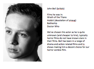

Now we have a better cast to fit our budget, they are an all British cast (including new directors). Our Directors fit more with our zombie genre and our budget. We finally have a name for our horror/dark humour comedy genre of film; A Zombie Movie.
Tuesday 21 January 2014
Pitch for our Title sequence


Subscribe to:
Posts (Atom)